Brxnd.AI and What Makes a Brand
How an AI-driven collab tool distills the visual and written language of brands
I first published this on Noah Brier’s brxnd.ai Substack, which has been an incredible source of exploration, curiosity and knowledge for AI in the world of marketing for the past few months. If this is up your alley, take a gander at what they’re up to as well
—
Brand collabs have become a staple of marketing; they’ve become so ubiquitous that even Skechers has a page dedicated to their collabs.
I’ve been playing around with brxnd.ai, a brand collaboration tool that uses generative AI to write content and create imagery. Yielding creative decisions to DALL·E 2 and GPT-3 provides interesting starting points for what a brand collaboration can be; it also generates fascinating observations about brands themselves. Noah Brier documented some of his initial observations here.
On the visual side, the AI distills each brand to its most recognizable form, thereby separating brands with strong visual identities from those with weaker ones. It creates strange concoctions.
First, let’s get visual.
Some evoke what could be possible, especially for brands with powerful visual identities. For example, here’s the Doritos logo:
And here are three Doritos brxnd.ai examples, in which the toxic orange color and the triangle shape (both of the chip and the brand) are prominent.
AI finds a different brand element that’s central to Swarovski. There’s little sign of the logo, but bling is the thing.
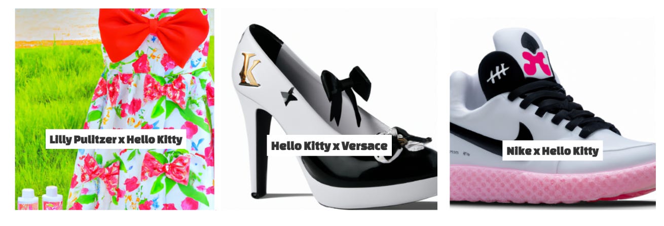
Hello Kitty is such a powerful visual that she overwhelms a few brands, even those with iconic colors or characters like Little Caesars and Burger King.
However in other collabs, the adorable Japanese kitten gets abstracted into just her ribbon and/or bits of her pink and red color ways.
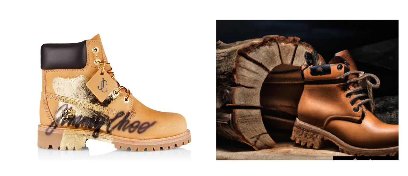
Some AI collabs are remarkably less awful than what made it into actual reality.
And many are curiosities, distant cousins to the brand elements you might expect, or even complete head scratchers.
Although the logo or other brand elements don’t readily appear, American Express collabs seem to capture some of the brand’s sophistication by gearing towards black.
The Write-Ups
So what is not being captured by the visual component of the AI? The ethos of the brand, something that sits beyond the recognizable. Here’s where the text comes in. It often captures the frothy descriptions of each brand and the brand purpose of them coming together, in an upbeat salesy tone. Here’s an absurd descriptor of a Swarovski x Instagram candy bar—blingy, feed-worthy, delicious.
“Looking for the perfect Instagram-worthy snack? Look no further than the new Swarovski candy bar! This limited edition treat is made with real Swarovski crystals and is sure to turn heads when you post a pic of it. With a delicious chocolate taste and beautiful crystal design, this candy bar is a must-have for any Instagrammer. So don't wait – grab a Swarovski candy bar today!”
And here’s one from Rolex x Grateful Dead. It notes conversion vans and jam bands, as well as Rolex’s classic design, quality, and accuracy.
The Rolex and Grateful Dead watch collaboration is the perfect accessory for any fan of the iconic jam band. The watch's classic design and high-quality materials are perfectly suited to any style, whether you're hitting the road in your conversion van or hitting the town with your buds. With accurate timekeeping and a durable construction, this watch will keep you on beat all day long.
These collabs are AI pulling together what’s most iconic or known about both brands into one product write-up. But between the cracks of what the AI engines develop is where you can find what’s missing. What makes these AI collabs feel not quite there?
Many IRL collabs are of the same ilk; fast ways to combine the powers and audiences of two brands with little true consideration of what it will mean for the brand. Here’s a write-up from an all-too-real Puma x Frosted Flakes collab.
To honor 70 years of Tony the Tiger, we teamed up with Kellogg’s on PUMA x FROSTED FLAKES. This sweet collaboration celebrates the iconic cereal and its beloved mascot with fun twists on Classic styles, including the Suede and Roma. Bright orange, vertical black stripes, and vintage graphics ensure the collection pieces look GR-R-REAT!
Brands like Liquid Death have found their way to poking fun at our obsession with collabs. Here’s their collab with Tony Hawk, a world-famous skateboarder that donated bits of his blood for every skateboard.
What brxnd.ai gives marketers, besides simply imagining collab possibilities, is a way to read the power of a brand and what it stands for.
—
You’ve just read Framing, a regular newsletter about what’s good culture, marketing, and business by Anita Schillhorn van Veen. I’m Director of Strategy at McKinney, on the lead team of Ladies Who Strategize, and a writer over at my other favorite Substack Why Is This Interesting.
I write this newsletter and distribute it freely because I enjoy writing and thinking through problems—if you enjoyed this, buy me a coffee or subscribe below.


