


A Healthy Palette
Not a typo--let's talk the aesthetics of "healthy" eating

I spent the last few days doing shop-alongs and consumer immersions--intensive forms of qualitative research where you spend time in people’s homes and on their shopping journeys. As you can imagine, the pandemic squashed this kind of research for the last couple of years. So for me it was exhilarating, as a person who prizes qualitative research, to spend long days poking in strangers’ pantries and cruising the aisles of Walmart. While shopping, if our research participants grabbed something that caught their eye, we’d pop it in the shopping cart. And if something caught our eye based on the research we’d been doing, we’d buy it as well.
Our consumers were people that were already living a plant-based lifestyle or were open to it. This is an exponentially growing group of people; brands like Impossible, Beyond, and Oatly have driven non-meat and dairy products beyond the vegan lifestyle. The functional foods industry is estimated to grow by about $10bn a year, meaning people are looking for more than just taste.
So what we ended up with was a smattering of products that were eye-catching and interesting to this mindset. And it looked like this:

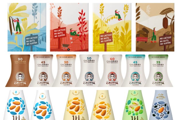
I’m calling this the healthy palette. A lot of white backgrounds and matte labels. There’s a millennial mauve that’s a toned down version of millennial pink. A robin’s egg blue that’s soothing to the eye. A cursive font that’s not quite hand-drawn, but is a nod to nostalgia and home-made. Hints of the farm and the product. The Corporate Memphis of the better-for-you products that show up in snack aisles, cereal aisles, drink aisles--almost every aisle of the grocery store.
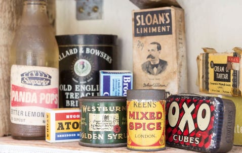
Compare this to the bright, primary colors of legacy brands. These colors were intended to be eye-catching and build brand associations. Walk down the chips aisle and you know Yellow = Lay’s and Blue = Ruffles. If you’re in crackers, Ritz = red, and Wheat Thins = yellow. Decades of research support that these bright, primary colors are the most eye catching.
But today the primary color approach reads as old-fashioned, or even worse, artificial and unhealthy. In the aisle, the onslaught of bright hectic colors can feel like Times Square. Newer brands offer a small oasis of calm for the eye, with a look that fits in with a generation that cares about the aesthetics of everything. The brands are developing new visual cues for foods that are “natural” (whatever that means) and “better-for-you” (whatever that means).
There’s the hand-drawn, muted-color version with illustrated cues of farmland, produce, and nature. Here, Chobani, Califia and Three Trees feel more idyllic, calm and relatable than the brash colors with bold graphics of yore.
Then we have slightly bolder colors—still on matte backgrounds—that hearken to a nostalgia.

They almost look like older generics for commodities, back to a fantasy when we could recognize all the ingredients.
All in all, it’s a brave new world for food products, with new visual cues being established as category norms.
—
You’ve just read Framing, a biweekly newsletter about culture, marketing, and business by Anita Schillhorn van Veen. I’m Director of Strategy at McKinney, on the lead team of Ladies Who Strategize, and a writer over at my other favorite Substack Why Is This Interesting.
I put this out for free because I enjoy writing and thinking through problems—if you enjoyed this, buy me a coffee or subscribe below.
Any new finds or even better, snack reccos?